Design
Mobile-First Design
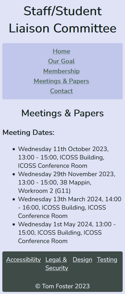
All parts of the site were designed in a browser set to responsive mode and a width of 320px as this is the minimum width before the site scrolls. I then used media queries to make the site look and feel better at larger resolutions.
Introduction
My design was influenced by working with videogame UIs. I was aiming for a fairly serious simple design that is easy on the eyes.
Site Map

Design Mock-ups


Design Reasoning
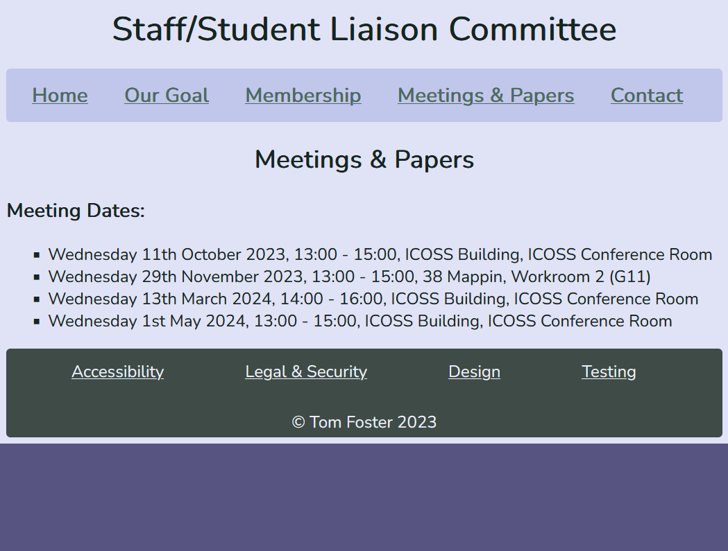
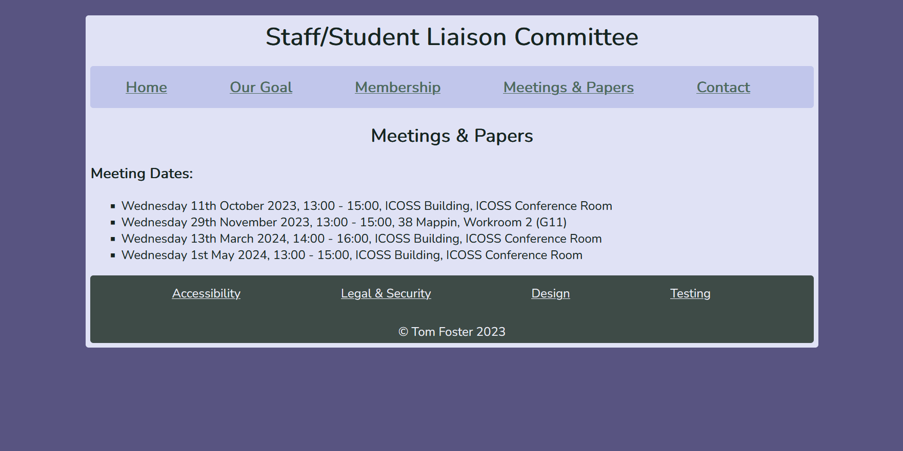
I will use 2 breakpoints at 500px and 800px with the default width being developed at being 320px.
I have chosen 500px as it is the approximate width at which the nav can be displayed as a row rather than a column.
I chose 800px as at this point it looked best to make the site occupy 80% of the viewport instead of 100% like it was bellow 800px.
Menu System
For the menu, I will use <a> HTML tags to link to different pages.
To fit all links in a neat navigation section at the top of the page, I will use flexbox defaulting to column.
This should ensure that all links fit on a mobile display. I can then use media queries to change the flexbox to
rows for larger widths as I think it will look neater.